
Aeri App
Project Summary
01
LIVE WEBSITE
Scope
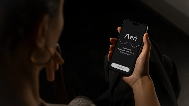
For Aeri, we designed and developed a minimalist and visually soothing app that gently guides users toward relaxation. With a clean design, visual white noise, and guided onboarding, Aeri teaches how to meditate effectively and practice breathwork. The app helps reduce stress, enhance athletic performance, and bring body and mind into balance throughout the day – one breath at a time.
Category
Services
App Concept and Branding
Appdesign and Development
UI / UX Design
Approach
Progressive Web App (PWA)
Headless Architecture
API-first Backend
Serverless & Cloud-Based
Accessible & Privacy-Compliant


Challenge & Potential
02
Translating Calm into Code: Designing for Stillness, Focus, and Flow
In a market saturated with overstimulating wellness apps, Aeri offered a rare chance to do less – and do it better. The brief wasn’t just to build another breathwork tool, but to create a digital experience that genuinely slows users down.
This meant stripping away the noise, designing for stillness, and building an interface where every element feels intentional. It was an opportunity to rethink how tech can support embodied presence – not distract from it. From architecture to interaction, every decision aimed to honor simplicity, accessibility, and emotional depth.
Groundwork
03
What we delivered
- Input Sprint
- Strategic Kickoff & Debrief
- Collaborative Workshop
- Competitive Audit
- User & Audience Research
Breathing Life into the Brand
Before a single pixel was designed, we dove deep into the heart of the brand. Through collaborative workshops, we aligned with the client’s vision, unpacked the emotional and strategic layers of their offer, and clarified what makes it truly unique.
From founder alignment to a thorough audit of brand touchpoints, this phase laid the strategic foundation for every creative decision that followed – ensuring consistency, clarity, and purpose throughout the project.
Your Space to Reconnect with your Breath, Body and Mind
Your Space to Reconnect with your Breath, Body and Mind.
Your Space to Reconnect with your Breath, Body and Mind.
Brand Strategy
04
What we delivered
- Creative Strategy
- Value Proposition & Positioning
- Brand Pillars & Narrative Development
- Tone of Voice Exploration
Strategic Groundwork for a More Human Interface
Aeri set out to answer a nuanced design challenge: How do you translate a physical, deeply somatic breath practice into a digital experience that feels calm, embodied, and emotionally resonant?
We began with collaborative workshops to define the core values: simplicity, presence, and somatic depth. These insights shaped a product experience that doesn’t just guide breathwork – it feels like breathing.
From there, we developed a minimalist, motion-led system that supports – rather than distracts from – the practice, allowing the breath to take center stage.


Visual Identity
05
What we delivered
- Visual Research & Moodboarding
- Brand Identity & Logo Design
- Color, Typography & Motion System
- Design System Documentation
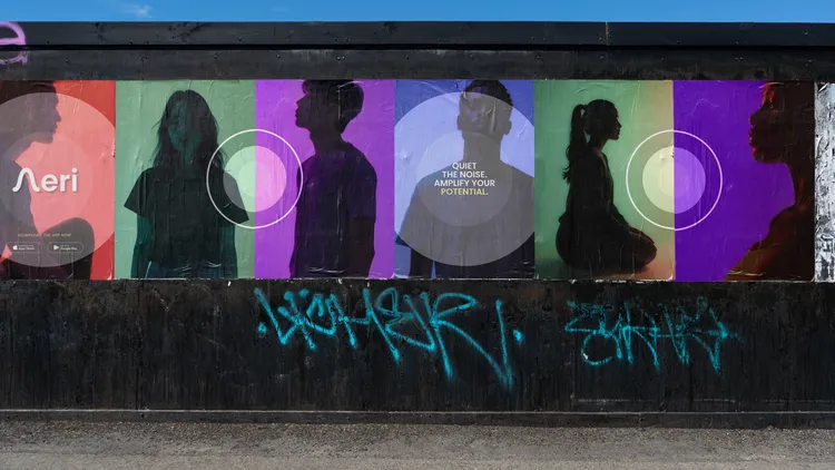
Designing for Everyone: From Olympians to Anyone Seeking Calm
Aeri was created for a wide spectrum of users – from elite triathletes training for performance, to individuals seeking relief from stress, anxiety, or chronic pain.
The client’s work with professional athletes inspired the app’s emphasis on somatic depth and precision, while their broad online community called for a tone that feels open and inclusive.
That’s why we designed a visual language that’s both dynamic and grounded – sporty enough to resonate with high-performers, but calm and accessible for everyone. Because breathwork isn’t just for the few – it’s for anyone who needs to slow down and reconnect.


Verbal Identity
06
What we delivered
- Tone of Voice Definition
- Messaging Framework
- Copywriting Guidelines
- Microcopy & UX Writing
- Naming
Finding the Right Tone
In close collaboration with the founder, we developed not just the tone of voice – but also the name Aeri. A name that conveys lightness without sounding esoteric, and instantly hints at what the product is about: breath.
The app’s language is intentionally minimal. Instead of long explanations, short and clear copy communicates what matters – especially during onboarding, which gently introduces users to breath techniques. And when a session ends, there are no stats – just a quiet affirmation to close the experience with intention.
Your breathing creates inner calm.
Each breath brings you balance and harmony.
You gracefully release what no longer serves you.
App Design
07
What we delivered
- UX Architecture
- Interface Design & Prototyping
- Onboarding Experience
- Motion Design & Microinteractions
- Audio Integration
- Frontend Prototyping / Implementation
- Design System Handoff
- Launch Assets & Support
Breath, Visualized.
Aeri set out to answer a nuanced design challenge: How do you translate a physical, deeply somatic breath practice into a digital experience that feels calm, embodied, and emotionally resonant?
We began with collaborative workshops to define the core values: simplicity, presence, and somatic depth. These insights shaped a product experience that doesn’t just guide breathwork – it feels like breathing.
From there, we developed a minimalist, motion-led system that supports – rather than distracts from – the practice, allowing the breath to take center stage.
Brand Identity & Logo
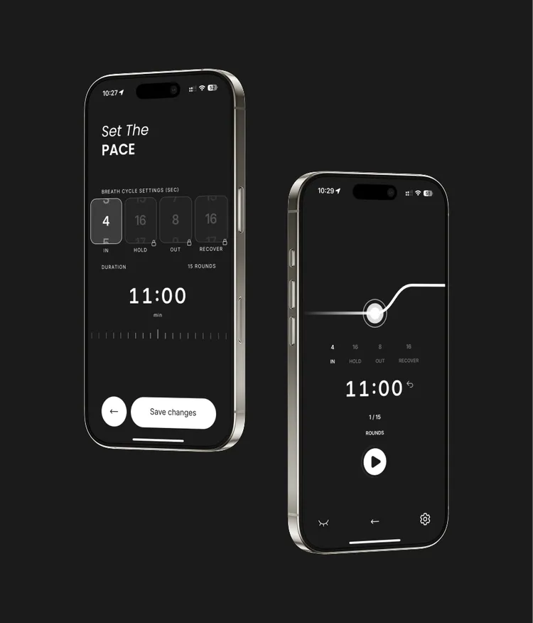
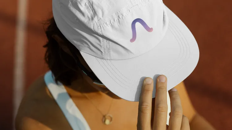
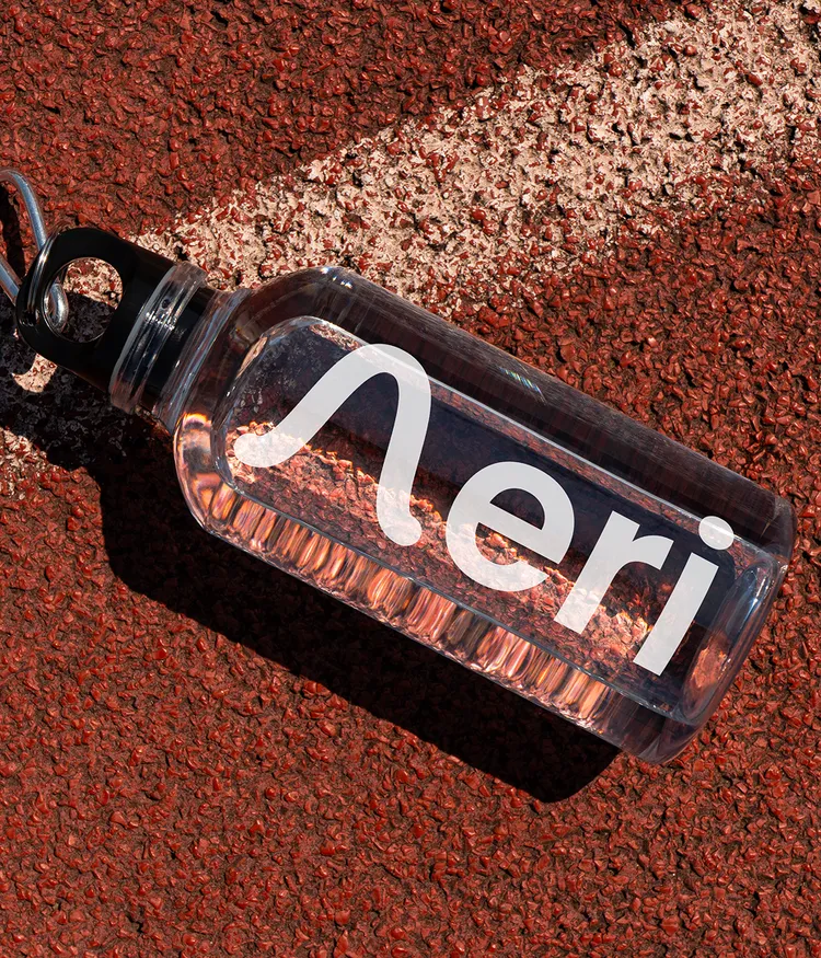
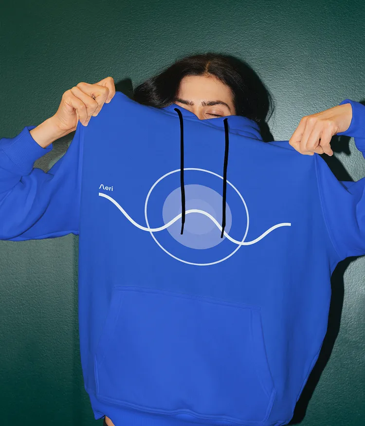
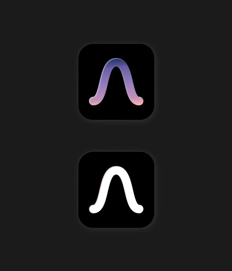
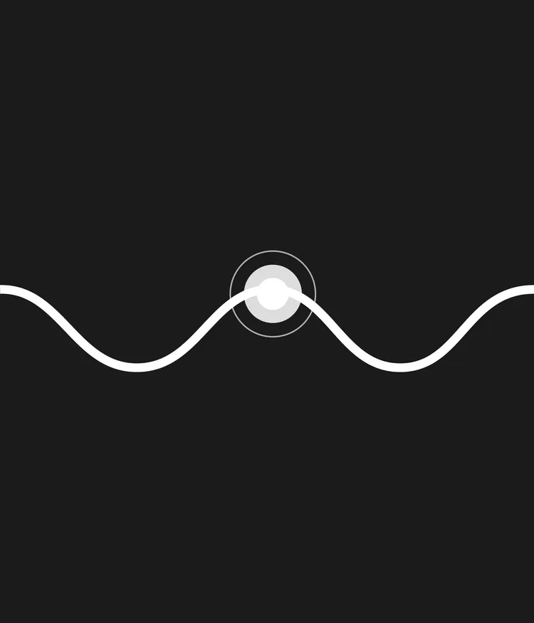
We created a logo that is minimal, organic, and rhythmically balanced — echoing the natural cycle of inhale and exhale. The shape of the “A” is derived from the wave-like line that flows through the app’s core experience, acting as a visual guide.
It captures the duality at the heart of the product: stillness and movement, clarity and emotion. More than just a letterform, the Aeri logo becomes a visual metaphor for presence — simple, calm, and deeply human.

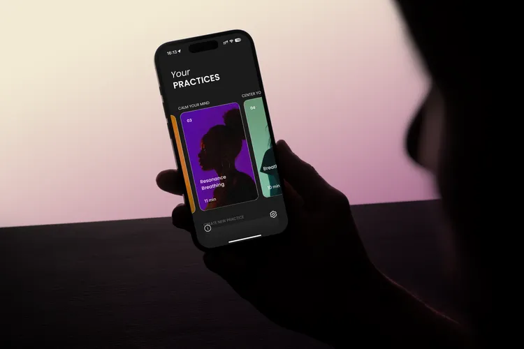
User Interface & Prototyping
Every element in the UI was intentionally reduced to its essentials. We focused on whitespace, accessible typography, and a spatial layout that promotes flow and clarity — designed to quiet the mind, not overload it.
Breath Visualizations & Microinteractions
One of Aeri’s signature features is the animated breath cycle. Instead of relying on language, we designed a motion-based system that visually guides users through each phase of the breath: inhale – hold – exhale. This somatic cueing turns the experience into something felt, not just followed.

Brand Activation
08
What we delivered
- UX architecture
- Onboarding experience
- Motion design
- Audio integration
- Interaction design
- Frontend prototyping
Where design meets practice
Aeri was built to be more than functional — it’s experiential. Every touchpoint is designed to support a calm, uninterrupted state of flow. From onboarding to guided sessions, the app removes friction and invites presence.
Visuals, sound, and motion work in sync to guide the user gently, without distraction. The result is an intuitive breathwork tool that feels almost invisible — because the best tools let you focus on what matters most.

UX Flow & Onboarding
The user journey is intentionally calm and clearly structured – from the first interaction to daily use. The onboarding experience gently introduces users to the fundamentals of breathwork.
They learn which posture supports relaxed breathing and how to consciously breathe into the abdomen and chest using the diaphragm and pelvic floor.
Motion & Sound Integration
Microanimations and a custom audio engine guide the breath experience with minimal UI. Soundscapes and transition tones sync with breathing rhythms to create a multisensory experience.
Customization
Users can choose from six visual themes tailored to different moods and times of day: Pure Black, Cool Horizon, Ocean Sand, Violet Pop, Lavender Twilight, and Sunset Sorbet.
They can also adjust tone pitch and toggle haptic feedback for silent use — with more personalization features already in development.
Are you ready to transform your brand?
Feel free to get in touch if you're interested in working with us or have questions about what we do. We're here to help.
Let's get started
Tech
Blueforte
Our plans
Copyright © 2026 Pola
Learn more
Directly to
TM