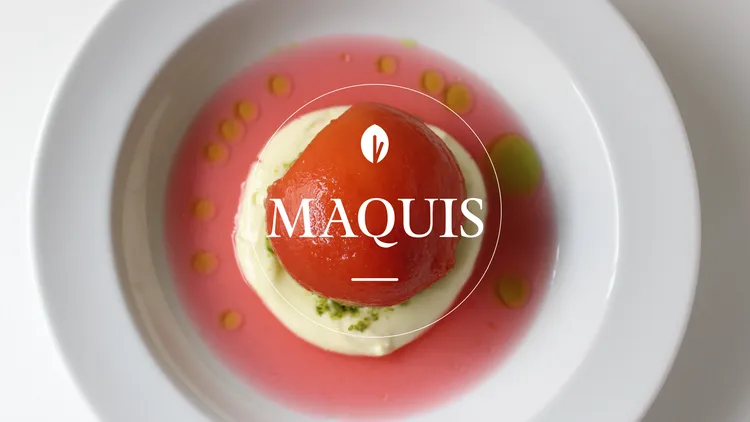
Pola

TM

The Maquis logo above a hand presenting an artfully garnished cracker.The Maquis logo above a hand presenting an artfully garnished cracker.

Maquis

Project Summary

01

Scope

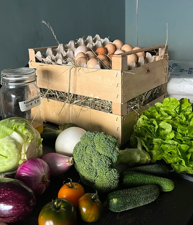
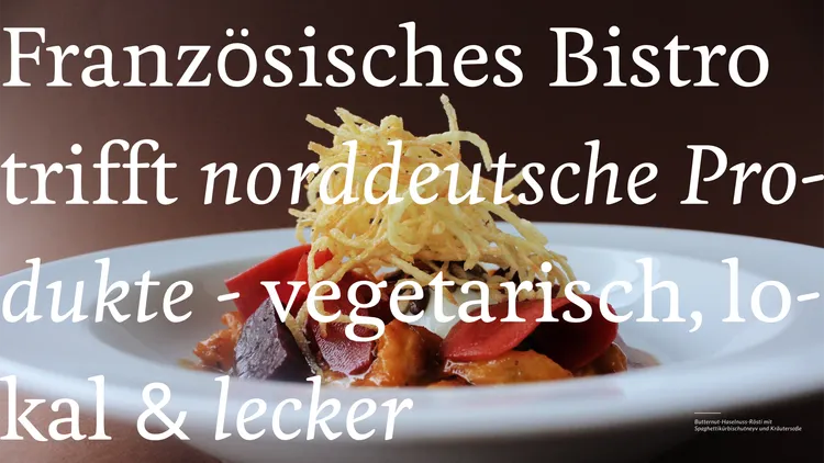
For Maquis – a charming vegetarian bistro in Hamburg-Altona – we created a new visual identity that reflects the essence of the restaurant: artisanal, sustainable, and approachable.
 The rebrand captures the team’s values – blending French bistro roots with local produce and creative vegetable cuisine. The new branding distills its attitude and origins – blending French bistro spirit, northern German produce, and creative vegetable cuisine. A cohesive web design extends this experience into the digital space.

Category

Local Business
Sustainable Brands

Services

Brand Design

Web Design

Copy Support

Maquis logo as a stickerMaquis logo as a sticker
Close-up of a man's chest wearing a beige T-shirt with a black Maquis logoClose-up of a man's chest wearing a beige T-shirt with a black Maquis logo
White Maquis logo and the lettering 'Vegetarian Cuisine' on a bed of green herbs and lettuce.White Maquis logo and the lettering 'Vegetarian Cuisine' on a bed of green herbs and lettuce.

Challenge & Potential

02

A Restaurant with Character – Brought to Life


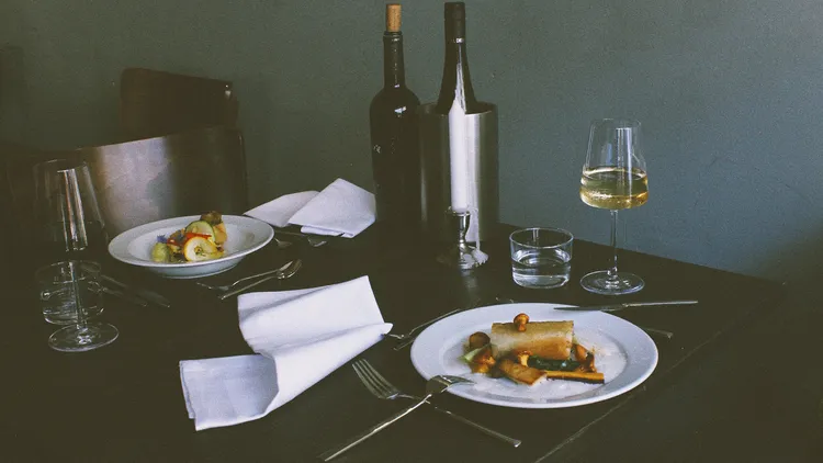
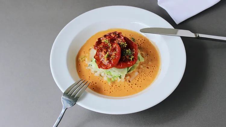
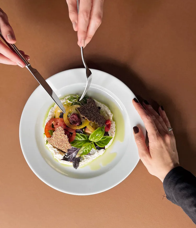
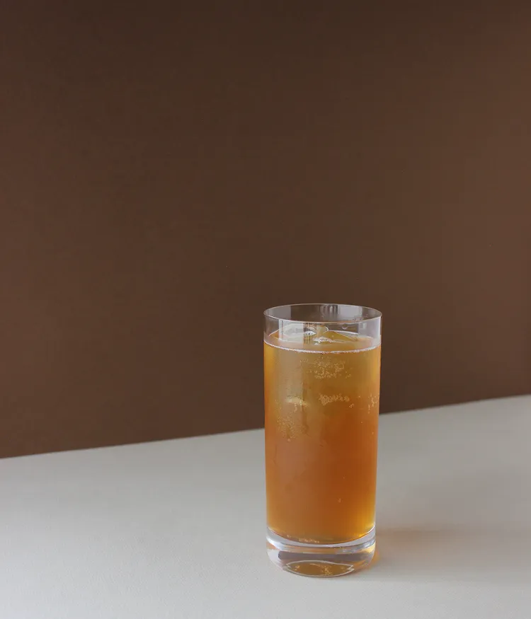
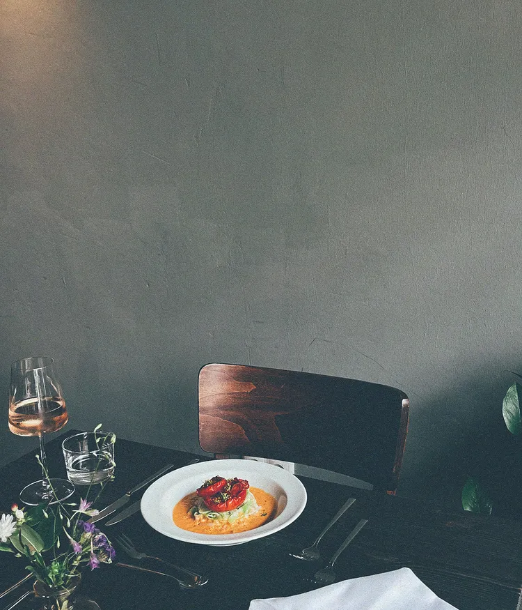
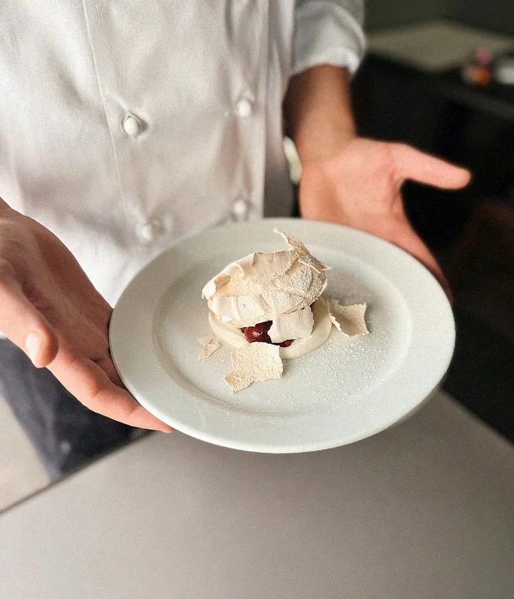
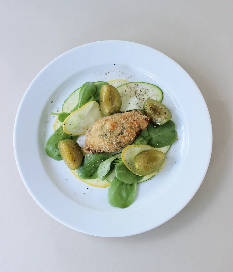
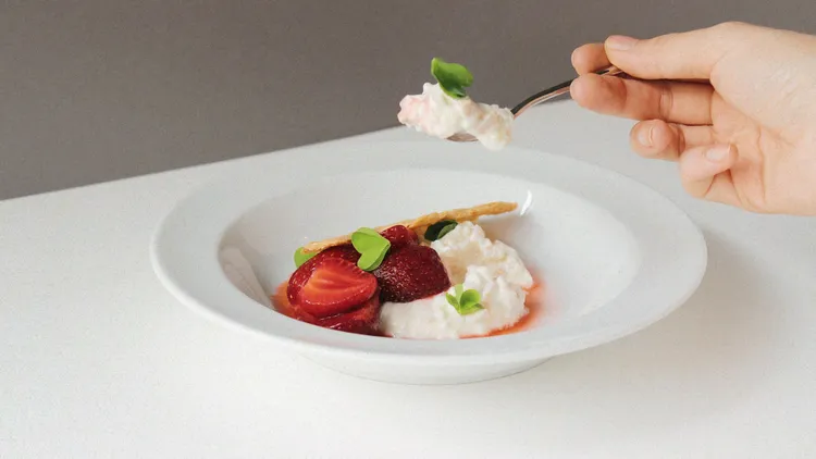
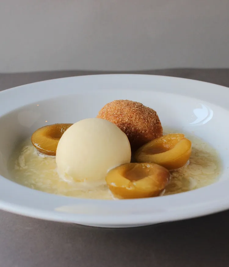
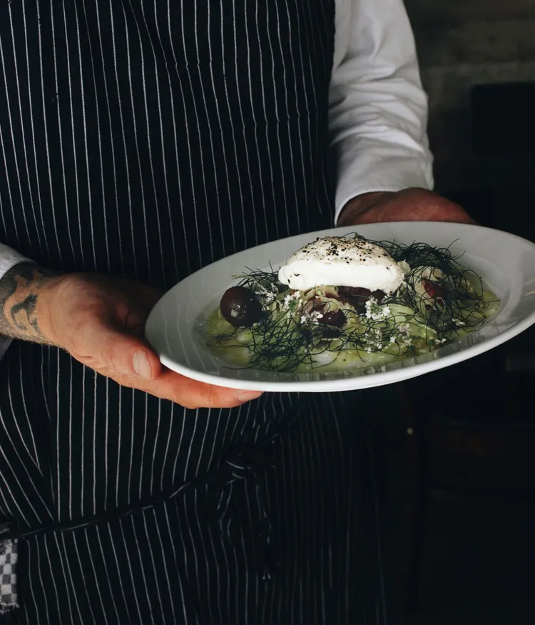
More than just a place to eat, Maquis invites guests to experience food with all senses. The challenge was to translate its unique combination of refined craftsmanship, creative cuisine, and northern grounding into a visual language — stripped of ornamentation, but rich in meaning.
Everything at Maquis is handmade — from the bread to the atmosphere.

A table set with wine and two dishes at Maquis restaurantA table set with wine and two dishes at Maquis restaurant
Five organic eggs and a hand reaching for one of the eggsFive organic eggs and a hand reaching for one of the eggs
Freshly delivered vegetables, eggs, and pickles beautifully arranged on a tableFreshly delivered vegetables, eggs, and pickles beautifully arranged on a table

Groundwork

03

What we delivered


  • Input Sprint
  • Stakeholder Interviews
  • Strategy Workshop
  • Competitive Audit

Between Craft and Conscience


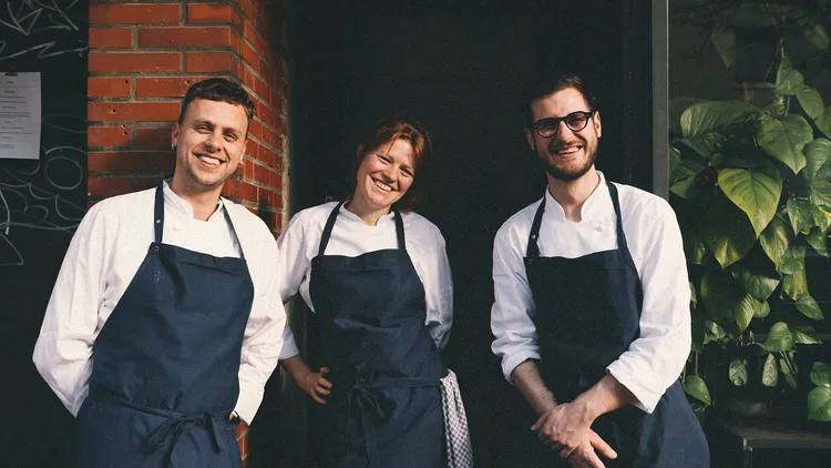
To clearly position the Maquis brand, we immersed ourselves in the world of the restaurant: conversations with the team, time spent in the kitchen and on the floor, a look at the competitive landscape – and, most importantly, at what truly sets Maquis apart.


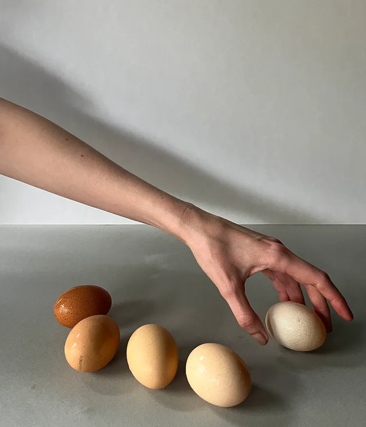
Maquis stands for a kind of cuisine that doesn’t need big words to make a statement: vegetarian, regional, crafted with care and quiet confidence.


In our brand groundwork, we uncovered and articulated these qualities – translating them into a clear brand stance, a distinct profile, and a strategic framework that now serves as the foundation for design, language, and long-term growth.

A view through the Maquis restaurant to the cozy lit barA view through the Maquis restaurant to the cozy lit bar
A plate with tomatoes on fennel vegetables in a tomato cream foam sauce from the Maquis kitchenA plate with tomatoes on fennel vegetables in a tomato cream foam sauce from the Maquis kitchen
The hands of two people sharing a very attractively arranged appetizer from the Maquis kitchenThe hands of two people sharing a very attractively arranged appetizer from the Maquis kitchen
Homemade, orange, finely sparkling Kombucha against an ochre background from the Maquis.Homemade, orange, finely sparkling Kombucha against an ochre background from the Maquis.

Brand Strategy

04

What we delivered


  • Creative Strategy
  • Value Proposition & Positioning
  • Brand Pillars & Narrative Guidelines
  • Tone of Voice Framework & Messaging Strategy

Purpose, not polish


Maquis isn’t built on trends or buzzwords – it’s shaped by real people, deep experience, and a clear culinary vision. Together with the team, we unearthed the essence of the restaurant and crafted a brand strategy that communicates authenticity without artifice.

At its core, Maquis is a modern vegetarian bistro that values quality over spectacle – rooted in regional ingredients, shaped by craft, and defined by openness. The new strategy brings this to the surface: a quiet confidence, cultural richness, and a human touch that invites people in.

A charming portrait of three chefs from the Maquis.A charming portrait of three chefs from the Maquis.
A set table in a cozy atmosphere at Maquis.A set table in a cozy atmosphere at Maquis.
A hand holds an iPhone displaying the weekly menu on the Maquis website.A hand holds an iPhone displaying the weekly menu on the Maquis website.
The round shop sign of Maquis with black logo on a white background.The round shop sign of Maquis with black logo on a white background.
A chef's hands presenting a dessert with meringue.A chef's hands presenting a dessert with meringue.
A portrait of the chef and founder Johnny Lindloff in an apron and chef's jacket.A portrait of the chef and founder Johnny Lindloff in an apron and chef's jacket.

Visual Identity

05

What we delivered


  • Logo Design
  • Typography & Color System
  • Visual Language
  • Design Principles

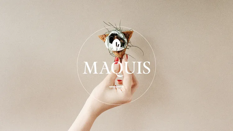
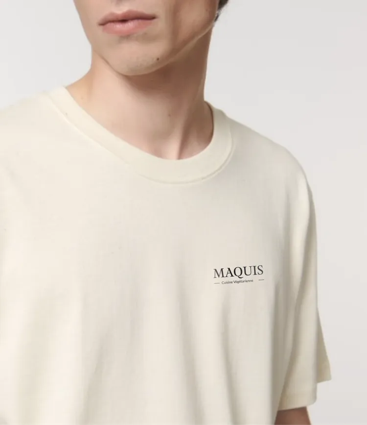
Grounded yet Distinct


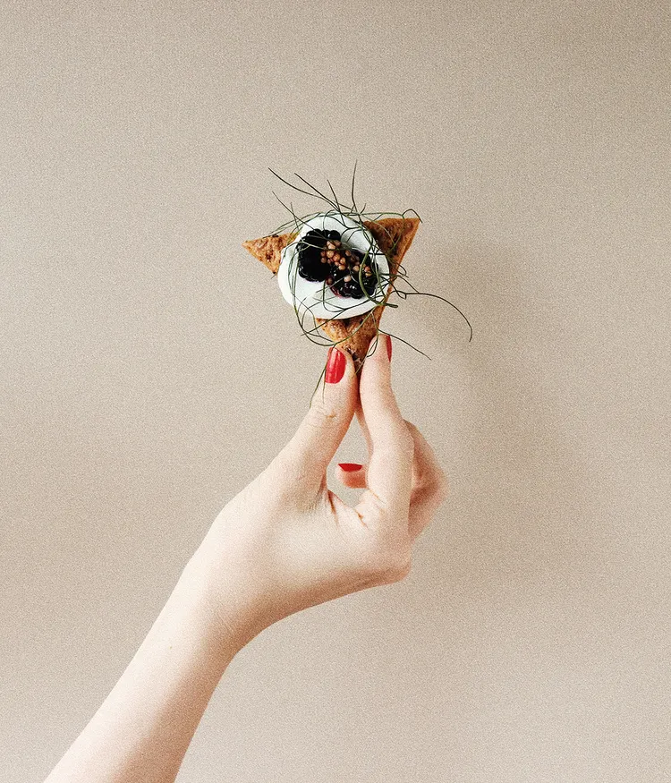
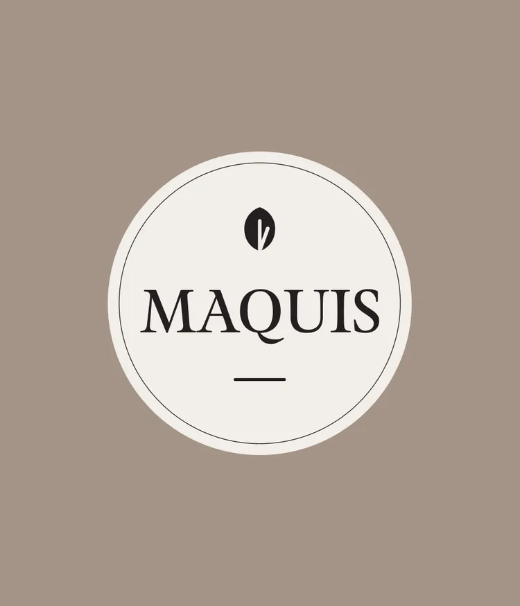
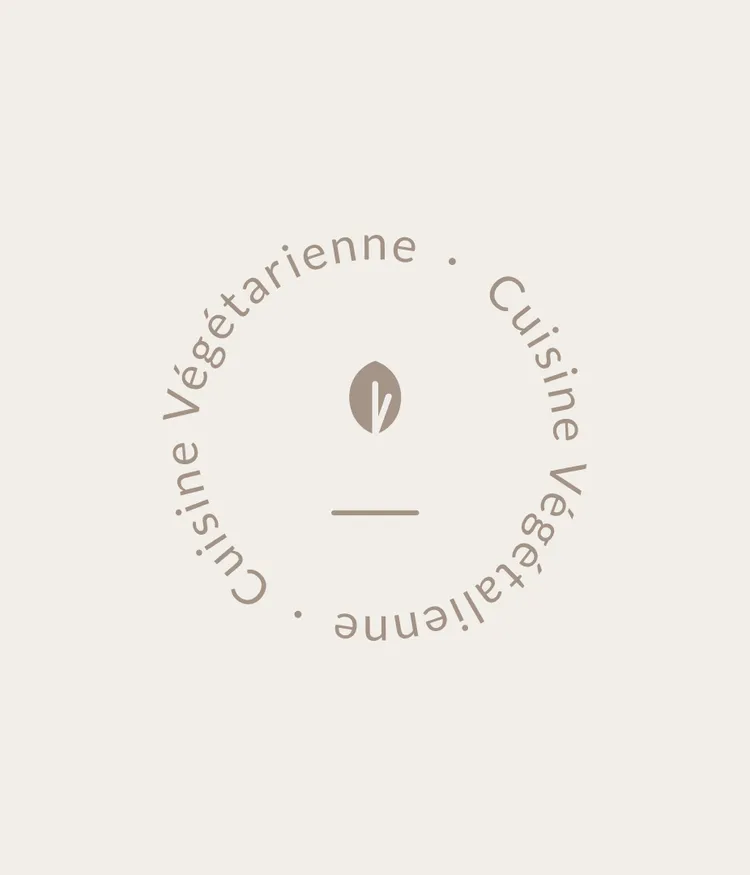
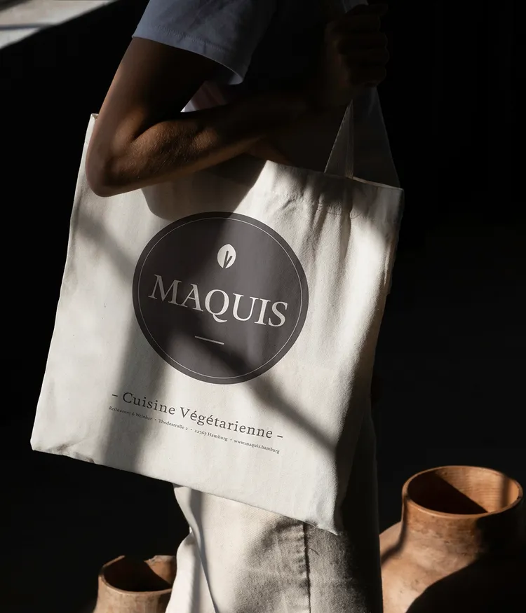
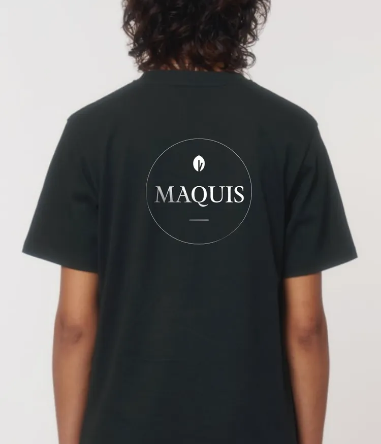
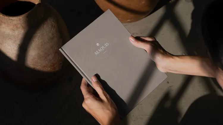
We developed a visual identity that captures the essence of Maquis: authentic, understated, and approachable. We designed an organically shaped logo, defined a calm and warm color palette, and created a system that brings clarity without flattening the brand’s character. A humanist serif typeface reflects the brand’s personality, while a hand-drawn leaf detail adds a subtle visual cue for craftsmanship and natural quality.

The Maquis logo on a red raspberry sorbet with mascarpone and basil oilThe Maquis logo on a red raspberry sorbet with mascarpone and basil oil
An elegantly arranged dish from the Maquis: crispy breaded eggplant with zucchini, fresh purslane, and sweet and sour plums.An elegantly arranged dish from the Maquis: crispy breaded eggplant with zucchini, fresh purslane, and sweet and sour plums.
A hand against a beige background holds an exquisitely presented cracker with crème fraîche and fine garnish.A hand against a beige background holds an exquisitely presented cracker with crème fraîche and fine garnish.

Verbal Identity

06

What we delivered


  • Brand Language & Tone of Voice
  • Key Messages for Web & Brand Touchpoints
  • Content Development for Digital Platforms

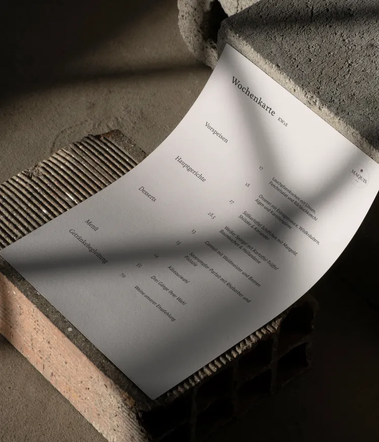
Warm & Precise — Not Loud or Pushy


Maquis doesn’t shout — it speaks clearly. The tone is calm, direct, and reflective — just like the concept itself.
Across the website, in the tagline, and even in the reservation process, the language expresses warmth, quality, and personality — unpretentious yet deliberate.


It avoids big words and instead creates a space where guests feel seen and understood.

The Maquis logo in black on a beige base against a taupe background.The Maquis logo in black on a beige base against a taupe background.
The leaf element from the Maquis logo with the surrounding text 'Vegetarian Cuisine' and 'Vegan Cuisine'.The leaf element from the Maquis logo with the surrounding text 'Vegetarian Cuisine' and 'Vegan Cuisine'.
A fine dessert from the Maquis kitchen – sweet strawberries and tender rice pudding, refined with aromatic clover.A fine dessert from the Maquis kitchen – sweet strawberries and tender rice pudding, refined with aromatic clover.
A fabric bag with a white Maquis logo on a black background, below the inscription 'Vegetarian Cuisine' and the restaurant's address in Hamburg.A fabric bag with a white Maquis logo on a black background, below the inscription 'Vegetarian Cuisine' and the restaurant's address in Hamburg.
Close-up of the back of a woman wearing a T-shirt with the Maquis logo.Close-up of the back of a woman wearing a T-shirt with the Maquis logo.
Close-up of two hands holding the Maquis restaurant menu.Close-up of two hands holding the Maquis restaurant menu.
A dish from the Maquis kitchen with donuts, ice cream, and flambéed plums.A dish from the Maquis kitchen with donuts, ice cream, and flambéed plums.
Weekly Menu at Maquis: Seasonal Highlights of the Week.Weekly Menu at Maquis: Seasonal Highlights of the Week.

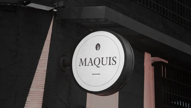
Logo & Brand Elements
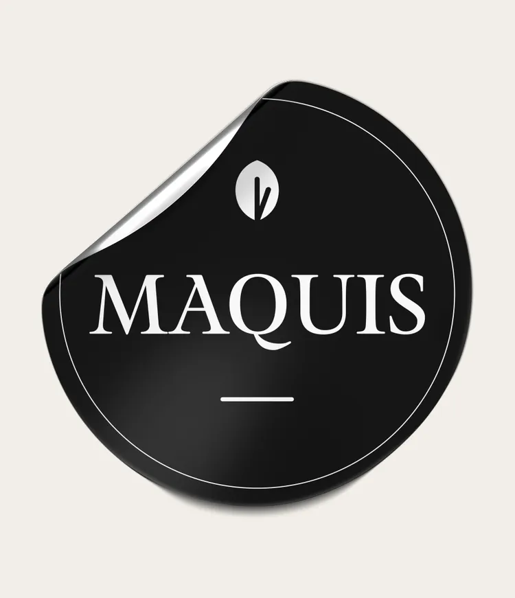
07

The new Maquis logo blends handwritten elements with graphic precision. It reflects artisanal cooking and a personal atmosphere – honest, subtle, and distinctive.
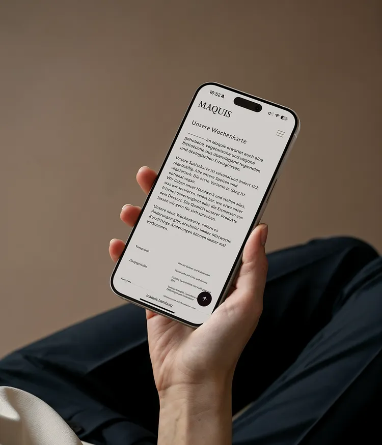
A cook's hands with a striped apron presenting a delicious-looking dish from the kitchen-Maquis.A cook's hands with a striped apron presenting a delicious-looking dish from the kitchen-Maquis.
The slogan 'Collect moments, not things.' in serif font on a taupe background.The slogan 'Collect moments, not things.' in serif font on a taupe background.
The phrase ‘French bistro meets northern German cuisine – vegetarian, local & delicious’ in large serif type above an image of an exquisitely plated dish.The phrase ‘French bistro meets northern German cuisine – vegetarian, local & delicious’ in large serif type above an image of an exquisitely plated dish.

Web Design

08

What we delivered


  • Visual Web Concept
  • Design & Structure of a One-Pager
  • Implementation with Carrd

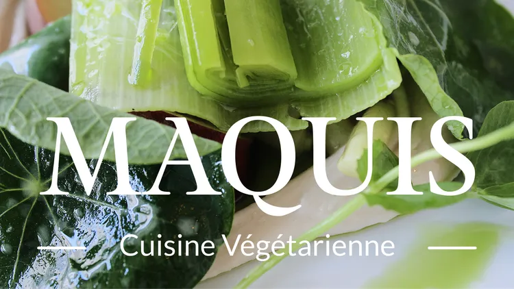
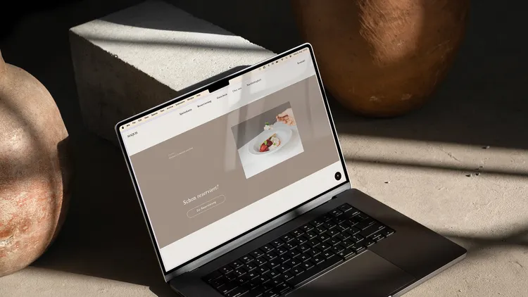
A Few Scrolls, a Full Atmosphere


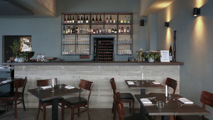
The new website is designed as a clean, visual one-pager — minimal, accessible, and aligned with the restaurant’s brand.


It brings imagery, color, and typography together to reflect what Maquis is all about: a grounded place with a strong identity and a handcrafted kitchen.

Laptop displaying the Maquis websiteLaptop displaying the Maquis website

Are you ready to transform your brand?

Feel free to get in touch if you're interested in working with us or have questions about what we do. We're here to help.

Let's get started

A colorful swirl with the KyberionAI logo on a black background.

Tech

KyberionAI