

Blueforte
Project Summary
01
LIVE WEBSITE
Scope
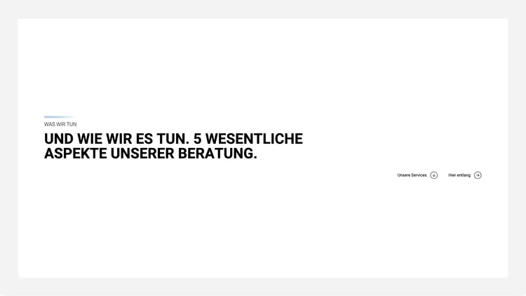
We helped Blueforte evolve its brand with a clear positioning, a refined brand architecture, and a sharper visual identity. Building on this foundation, we created a new website that presents Blueforte as a modern, expert, and forward-thinking consultancy. Our work covered the full process—from concept and UX/UI design to development and implementation.
Category
Services
Re-Branding
Webdesign and Development
UI / UX Design
Approach
Progressive Web App (PWA)
Headless Architecture
API-first Backend
Serverless & Cloud-Based
Accessible & Privacy-Compliant
Technologies
Challenge & Potential
02
Making expertise visible, turning complexity into clarity
Blueforte operates at the intersection of data, strategy, and enterprise processes. The challenge: to make a brand visible whose impact often unfolds behind the scenes.
Our task was to position Blueforte as a modern thought leader—combining deep technological know-how with strategic insight. The new website needed to convey clarity and credibility while remaining grounded and approachable.
The relaunch was an opportunity to refine Blueforte’s brand identity and build a digital presence that communicates trust, expertise, and ambition.


Discovery
03
What We Delivered
- Input Sprint
- Strategy Kickoff & Brand Positioning
- Stakeholder Workshops
- Brand and Competitor Analysis
- Design Foundation
Define Your Edge, Earn Trust
Before design or development began, we laid the strategic groundwork together with Blueforte. What defines the brand? What drives the people behind it? And how can complex B2B services become intuitive and approachable online?
Through collaborative workshops and in-depth research, we clarified Blueforte’s brand DNA – striking a balance between business clarity and human connection. The goal was to build a strategic foundation that would inform every touchpoint with consistency, confidence, and purpose.
This phase ensured that the brand wasn’t just designed — but deeply understood, with a voice, tone, and visual direction that reflect its true strength.
Together, we shape your digital transformation with pioneering Data Analytics & AI solutions – sustainable and collaborative. Together, we shape your digital transformation with pioneering Data Analytics & AI solutions – sustainable and collaborative. Together, we shape your digital transformation with pioneering Data Analytics & AI solutions – sustainable and collaborative.


Brand Strategy
04
What We Delivered
- Creative Strategy
- Value Proposition & Positioning
- Brand Pillars & Narrative Development
- Tone of Voice Exploration
From Data Questions to Shared Solutions
Blueforte operates in a complex market – data-driven, fast-paced, and often abstract. Our challenge: to develop a brand strategy that makes expertise tangible and builds trust.
Through collaborative workshops, we uncovered the brand’s core: clarity, partnership, expertise and progressiveness. This strategic foundation shapes not only what Blueforte does – but more importantly, how it feels to work with the brand.
From there, we developed a brand framework that balances relevance, competence, and a human touch – guiding every creative and communication decision that followed.


Visual Identity
05
What We Delivered
- Moodboards & Visual Direction Development
- Logo Refinement & Visual System
- Colors, Typography & Icons
- Photography
- Brand Guidelines & Design System Documentation
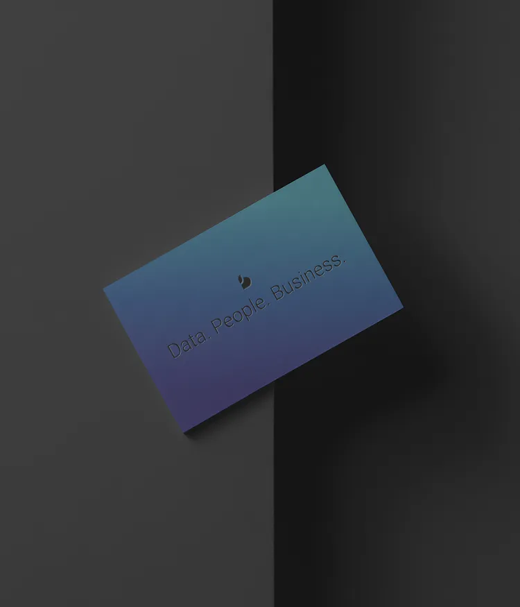
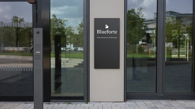
Tech Meets Human – Visual Identity for Blueforte
At Blueforte, data is at the core – complex and strategically valuable. The challenge: creating a visual identity that not only informs, but builds trust. A brand that conveys analytical depth while staying clear, precise, and accessible.
The resulting design system reflects these values through a strong wordmark, a calm color palette, and structured layouts that give space to what matters. Technical, yet human. Serious, yet never stiff. The new look reinforces Blueforte’s role as a trusted data partner for businesses of all sizes – from startups to enterprise-level clients.


06
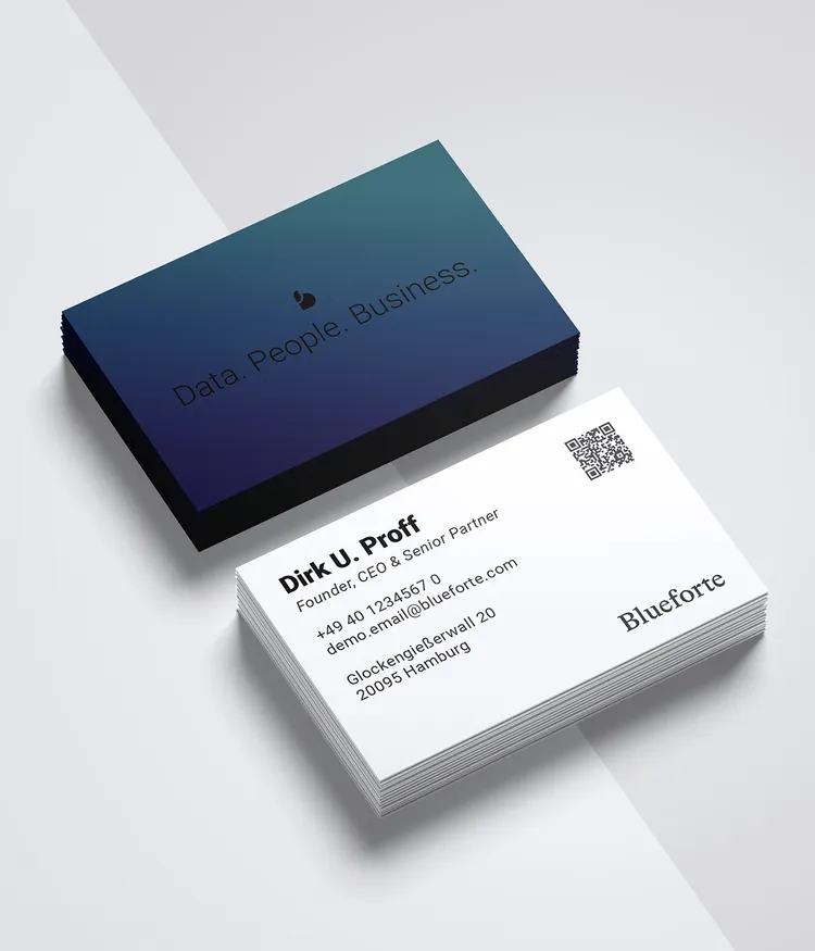
Brand Identity & Picture Mark
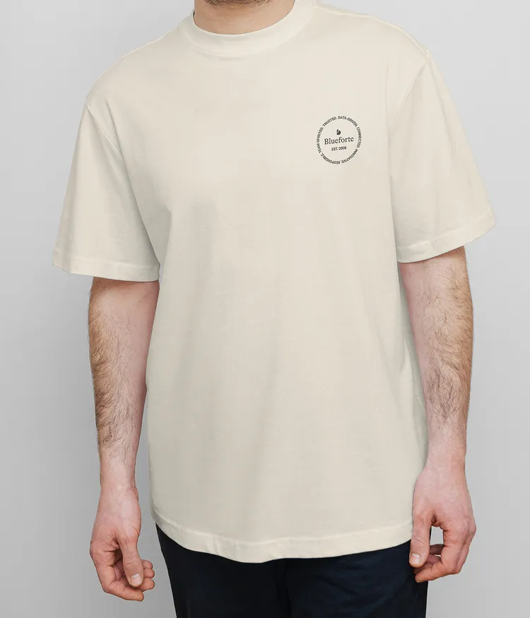
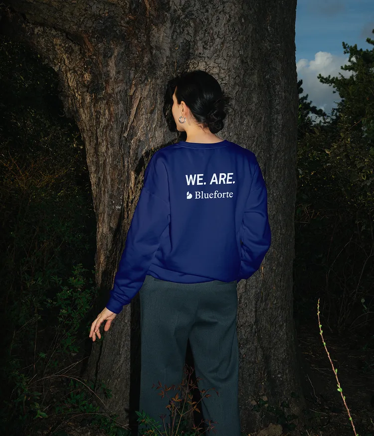
To expand the existing brand logo, we created a standalone symbol: an abstract “b” that feels both familiar and distinctive. Its organic form reflects the iconic simplicity of leading tech brands, with a leaf-like shape forming the upper stroke — a subtle reference to Blueforte’s commitment to sustainability.
The new symbol works independently from the wordmark, offering flexibility and a strong visual anchor across digital touchpoints. It conveys clarity, adaptability, and responsibility — translating the brand’s essence into a minimal, future-oriented design language.


Verbal Identity
07
What We Delivered
- Brand Language & Tone of Voice
- Voice & Messaging Framework
- Key Messages for Web & Brand Touchpoints
- Content Development for Website & Navigation
Words That Clarify – and Build Credibility
Blueforte stands for deep data expertise, strategic thinking, and collaborative consulting. That needed to come through in the brand’s voice – without jargon, fluff, or corporate clichés. The new tone is clear, structured, and approachable: speaking to decision-makers and technical teams alike, understandable without oversimplifying, and confident without being cold.
Together, we crafted a voice that speaks plainly – professional, but never distant. From the brand claim to the website navigation and key messaging, the verbal identity now flows consistently across all touchpoints. Language becomes a strategic tool: creating clarity, building trust, and guiding users with purpose.
WITH OUR PASSION FOR DATA, WE MAKE DECISIONS EASIER. WE SIMPLIFY PROCESSES. WE INCREASE MARGINS. WE DRIVE CHANGE – SUSTAINABLY. WITH OUR PASSION FOR DATA, WE MAKE DECISIONS EASIER. WE SIMPLIFY PROCESSES. WE INCREASE MARGINS. WE DRIVE CHANGE – SUSTAINABLY. WITH OUR PASSION FOR DATA, WE MAKE DECISIONS EASIER. WE SIMPLIFY PROCESSES. WE INCREASE MARGINS. WE DRIVE CHANGE – SUSTAINABLY.

Web Design
08
What We Delivered
- UX Architecture
- Interface Design & Prototyping
- Motion Design & Microinteractions
- Frontend Prototyping / Implementation
- Design System Handoff
- Launch Assets & Support
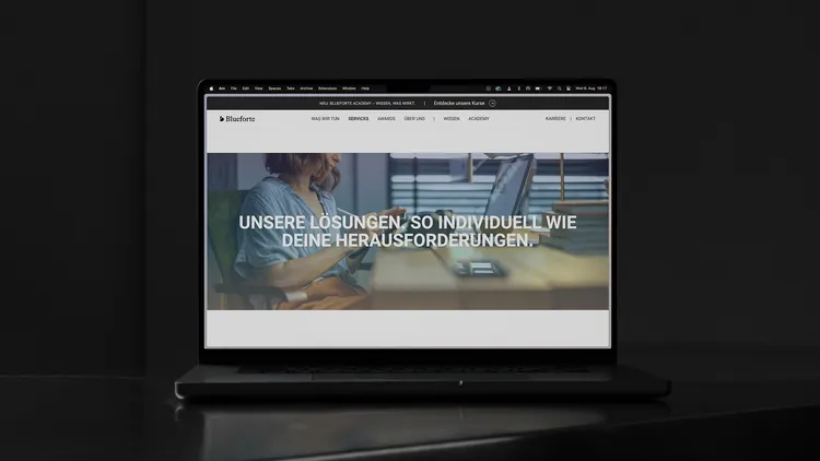
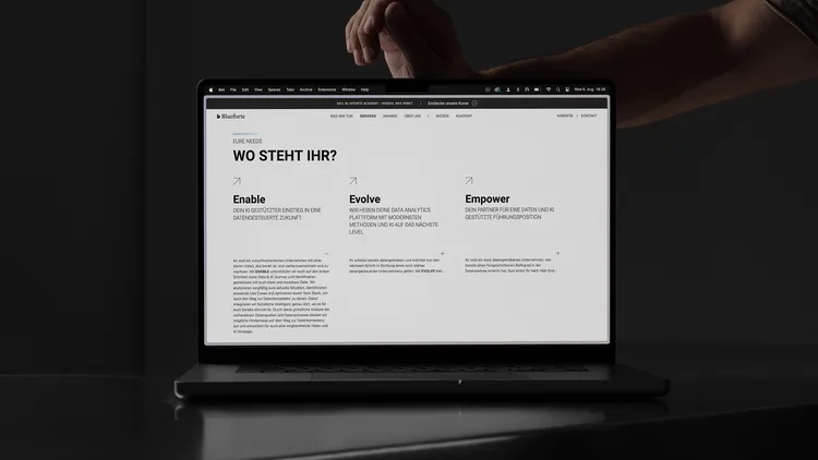
A Strong Framework for Powerful Content
The new Blueforte website needed to be more than just a digital business card – it had to make the company’s broad service portfolio and deep expertise understandable, engaging, and accessible.
Our focus was on building a clear UX architecture, paired with a clean interface, thoughtful microinteractions, and a consistent design system.
The result: A website that impresses not only visually, but also in its technical execution – modular, scalable, and user-focused. Turning complexity into clarity – and information into a meaningful brand experience.


Markenaktivierung
09
What We Delivered
- UX Architecture
- Scroll-Driven Storytelling
- Microinteractions & Motion Design
- Signature Gradient Application
- Typography & Visual Language in Use
- Frontend Prototyping & Implementation
- Launch Assets & Support
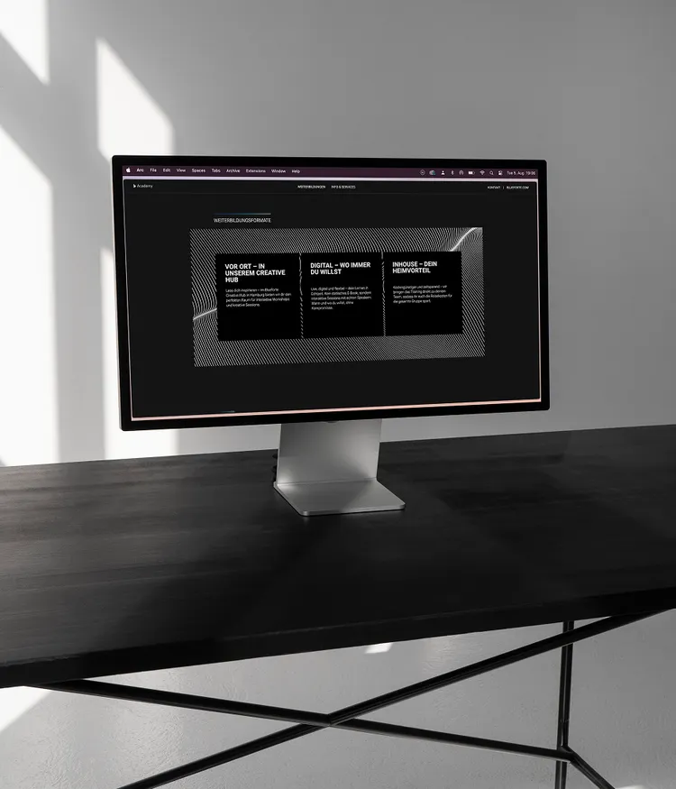
The Blueforte Design System in Action
We designed Blueforte’s interface with deliberate visual restraint. Generous whitespace, clear typography, and a calm, structured layout create space for focus and orientation — not distraction or overload.
Bold headlines and animated statements accompany the experience, revealing themselves as users scroll. They add presence, emphasize confidence, and make the strength of the brand both visible and tangible.
UX Flow
The UX flow of the new Blueforte website guides users intuitively through content, services, and offerings. Clear structure, smart navigation, and interactive micro-elements create a seamless experience that builds trust and fosters connection — from first contact to conversion.


The Pulse Behind the Brand
Flowing from deep Night Blue to a crisp, vibrant Ocean Blue, the Blueforte signature gradient captures the brand’s forward momentum. It’s more than a visual device — it’s a symbol of motion and change. Often blending softly into the white background, it evokes a sense of speed, like a motion blur in constant transition.
Applied as a subtle overlay on imagery or as a precise underscore beneath headlines, the gradient quietly anchors the content in the brand’s energetic presence. Paired with athletic visual cues, it reflects a brand that’s always in motion — bold, clear, and moving ahead.


Are you ready to transform your brand?
Feel free to get in touch if you're interested in working with us or have questions about what we do. We're here to help.
Let's get started
Education
The Green School
Our plans
Copyright © 2026 Pola
Learn more
Directly to
TM